Chemistry 107/108 Help Packet
Microsoft Excel
Terry L. McAlister
The goal of this packet is to give a brief introduction on how to use Excel for the purpose of generating graphs in the chemistry lab. It is important that you understand that Excel is a powerful spreadsheet program and the information contained herein is a small percentage of what the program is capable.
Required Graph Features:
- Computer generated.
- Descriptive title (with Figure number).
- Axes labeled, including appropriate units.
- Axes indicate proper significant figures.
- Data points visible.
- Non-linear data connected with a smooth curve.
- Linear Data subjected to regression (Trend line) with equation shown on graph. Equation uses appropriate variables.
- Full page printout.
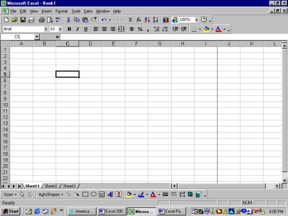
Figure 1: The Excel screen. Familiarize yourself with the menus and shortcut icons.
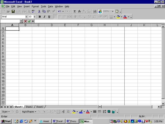
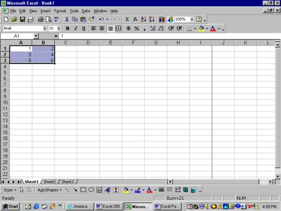
Figure 2: Entering Data
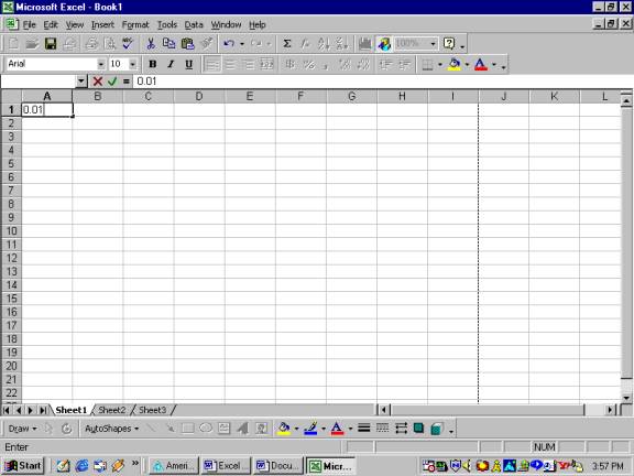
To enter data in the worksheet, first select the cell in which you wish the data to appear. Then, begin typing and the data will appear both in the cell and the formula bar, or left click in the formula bar and then begin to type. The data will appear both places. You will find graphing easier if you enter your x-values in a left-hand column, and your y-values in a right-hand column.
Figure 3: Formatting Cells for Significant Figures
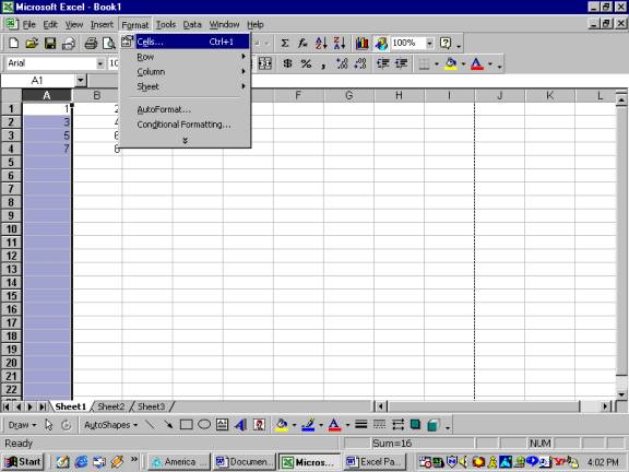
Once your graph data has been entered, you need to account for the significant figures of your data. The cells must be formatted to hold the appropriate number of decimal places, else the graph will show the minimum number needed. Once you decide on the proper number of decimal places, highlight the entire column of data by left clicking on the letter of the column, left click on the Format pull-down menu and then left click on Cells as indicated in Figure 3.
Figure 4: Format Cells Screen
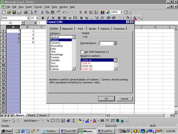
Choose the Number tab, and the Number Category. Set the required number of decimal places that will satisfy the accuracy of your measurements. Also, note the other possibilities for formatting data, such as scientific notation. Use a format most appropriate for your data. Click OK.
Figure 5: Adjusting Cell Width
Excel may show cells containing numbers larger than the
column width with ##### symbols. To
adjust the width of the column, place the cursor on the line between the column
letters. The cursor will change to look like:![]() Left
click and drag to the right or left to adjust column to the desired width.
Left
click and drag to the right or left to adjust column to the desired width.
Figure 6: Preparing to Graph Data
To graph your data easily, be sure that you have entered data for the x-axis in a left-hand column and the values for the y-axis in a right-hand columns. Highlight the data to be graphed by selecting the upper left-hand corner cell to be graphed, left click and drag to the right and down until all cells to be graphed are highlighted. Release the left mouse button.
Figure 7: Inserting a Chart
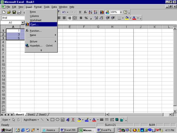
After the proper cells have been highlighted, left click on the Insert drop-down menu and then left click on Chart.
Figure 8: Chart Type
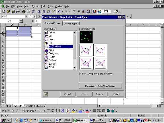
A series of chart types (Column, Bar, Pie, etc.) will be
shown. For CHEM 107 and 108, you will
typically choose the Chart type: XY (Scatter). Then click on the necessary chart
sub-type. That is, data with no
connecting line; data connected with a smooth curve, etc. If the data is linear, typically choose no
connecting line, as shown above, and add a Trend line later (See below.). Titration curves, for example, will generally
use the sub-type connecting with a smooth curve, since no Trend line is used. Click Next, and a “rough graph” is displayed.
Figure 9: Chart Source Data
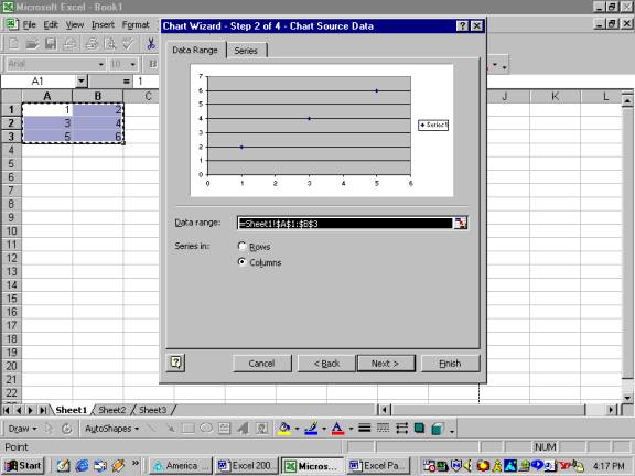
Changes in the location of the data to be graphed can be made from this window, but if you have used the x-axis data in column A, and y-axis data in column B, the graph should look correct. If you have many columns of data and need to only use certain columns, press and hold the Ctrl key and left click on the columns of data you need.
Figure 10: Chart Options
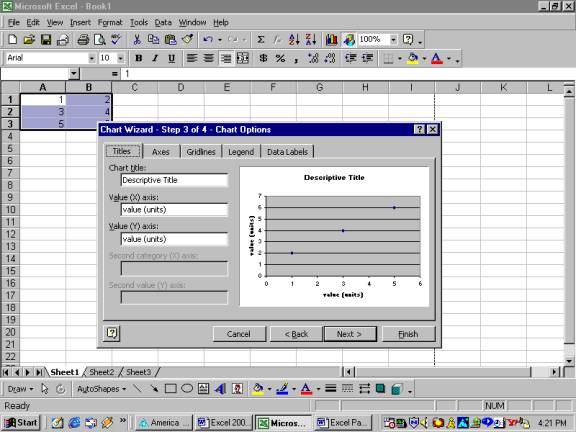
Click Next to bring up the Chart Options window. When at this screen, you can enter a chart title and the labels for the x-axis and y-axis. Be sure to use a descriptive title with figure number and include axis units. If there is only one column of y-data, then no legend is really needed and can be turned off by left clicking on the legend tab and deselecting “show legend”. There are also other options, such as graph gridlines and data labels, which can be explored by left clicking on the individual tabs. Click Next to bring up the Chart Location window.
Figure 11: Chart Location
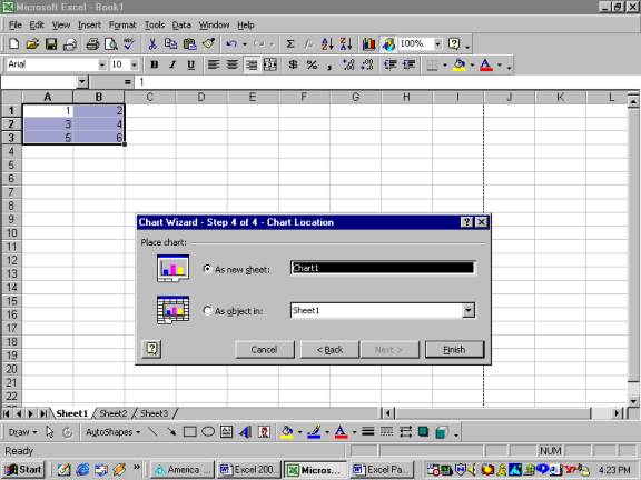
For most users, you will want a full page graph, therefore
select “As new sheet” for the chart location.
Then click Finish.
Figure 12: Full Page Graph, floating toolbar, and New Chart pull-down menu
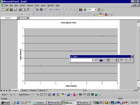
A screen similar to Figure 12 should appear on your screen. Also, it is important to note that a new pull-down menu has also appeared in the main toolbar (where file and edit, etc. are located). This new menu is the Chart menu. Also, there should be a chart toolbar “floating” over your graph. To change Chart Options at this point, use the Chart menu, or right click on the graph.
Figure 13: Adding a
Trend line
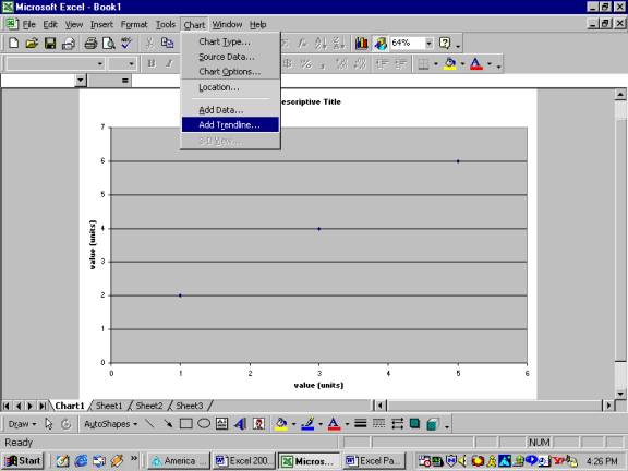
To add a trend line to linear data, click on the Chart pull-down menu and then left click on Add Trend line to open the Trend line window. Please note that it may be necessary to expand the pull-down menu by left clicking on the double down arrows at the bottom of the menu.
Figure 14: Choosing
a Trend line
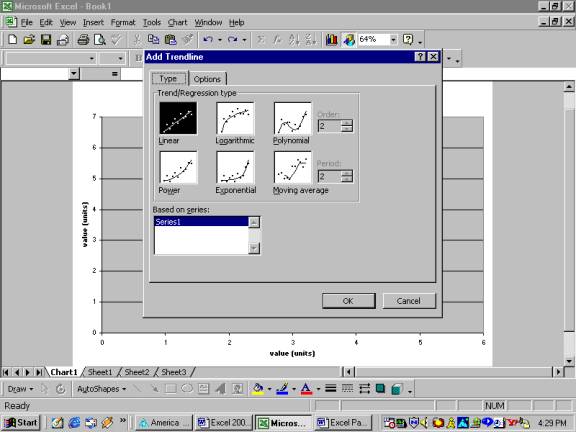
Choose the type of Trend line (linear logarithmic, polynomial, etc,) desired. For this course, you will mainly, if not always, use Linear. After selecting the desired trend/regression type, left click on the Options tab.
Figure 15: Options Tab Menu of Add Trend line Window
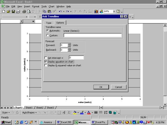
For linear data, it is required that you display the equation on the chart. Once in the Options sub-window, select Display equation on chart by left clicking in the appropriate box as indicated in Figure 15. From this window, it is also possible to extrapolate your Trend line beyond the measured data. Click okay to add the trend line and equation to your chart.
Figure 16: Editing Trend line Variables
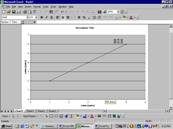
The equation may be relocated by left clicking and dragging the equation. Finally, left click on and edit the equation variables to something more appropriate, rather than the generic x and y.